Redefining Luxury: Designing the World's
First Ethical Online Department Store
Creating a strong brand identity is a strategic process that involves several key steps:
1. Defining the Brand:
Mission and Vision: We identified a gap in the market for an luxury department store that was exclusively online and ethical. The brands mission and aesthetics felt like an evolution of Green Salon.
Target Audience: We identified our target audience as affluent women in the 40+ segment. Professional women with disposable income. Our secondary audiences was identified as the ‘trendy London mum’, grandparents and corporate gifting.
Brand Values: Luxury. Elegance. Curated. Ethical.
Brand Personality: Professional. Innovative. Conscious.
2. Conduct Market Research:
Competitive Analysis: Analyse your competitors' branding to identify gaps and opportunities.
Customer Insights: Gather feedback from your target audience to understand their perception of your brand.
3. Develop Brand Guidelines:
Brand Voice: Establish the tone and style of your communication.
Visual Identity: Create a visual style guide, including logo, color palette, typography, and imagery.
Brand Messaging: Develop key messages that resonate with your target audience.
4. Design Brand Elements:
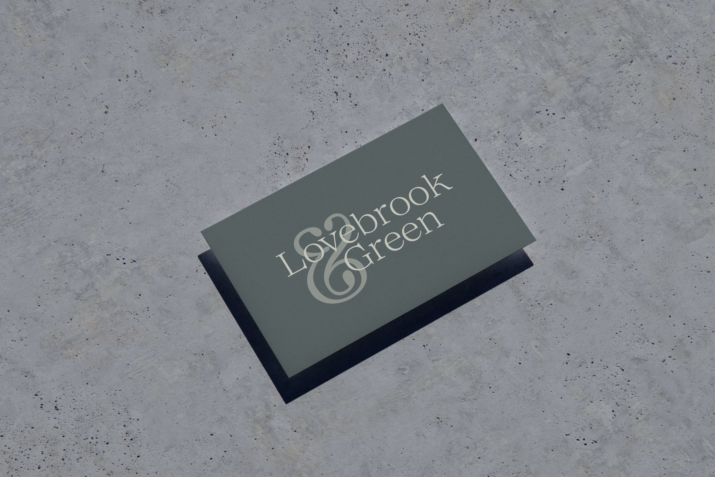
Logo Design: Due to condentiality reasons, the final logo can not be show until official launch, however mock-ups are displayed below.
Colour Palette: This felt like another evolution of the Green Salon colour scheme. It was elevated to create a high-end luxury feel. The colour palette was inspired by nature, whilst also influenced by quintessial British colours. Each department has it’s own colour palette, as well as, the website itself. In total there are 10 colour schemes that have a primary and secondary colour (used as an accent colours). The challenge was allowing each department to speak for itself and be recognisable. Whilst complimenting the other colour palettes.
Typography: Again, the primary typeface chosen was an evolution of Green Salon’s existing branding based off the brief from the Founder.
Imagery: A consistent and curated visual style is shown throughout the mock-ups of the webpages. This has resulted in outreached brands being extremely impressed with the website and have been able to visualise themselves within these departments.
Customer Experience: The colour palette were tested for accessibility. The UX/UI was designed in mind with data the shows the eye pattern trends of online consumers. This enabled me to create something that was visually stimulating and would optimise click rate.
The Departments
Home & Garden
Food Hall
Women
Men
Kids & Toys
Beauty & Wellbeing
Rare &
Beautiful
Gifting
Logo Mock-Ups
![Free Paper Coffee Cup with MacBook Mockup[78].jpg](https://images.squarespace-cdn.com/content/v1/62af5723f951920a26644e69/6d5738af-3695-48db-8e4a-b992052c3bb7/Free+Paper+Coffee+Cup+with+MacBook+Mockup%5B78%5D.jpg)
![Free Cotton Bag Mockup[64].jpg](https://images.squarespace-cdn.com/content/v1/62af5723f951920a26644e69/31e9b5d3-ca5e-477e-9344-c018ae333aba/Free+Cotton+Bag+Mockup%5B64%5D.jpg)
![Free Eco Bag Carrying by Man Mockup[34].jpg](https://images.squarespace-cdn.com/content/v1/62af5723f951920a26644e69/286ef05a-6f6f-49c1-8483-56a9945a0e78/Free+Eco+Bag+Carrying+by+Man+Mockup%5B34%5D.jpg)
![Free Bottle on Table Mockup[26].jpg](https://images.squarespace-cdn.com/content/v1/62af5723f951920a26644e69/396ec23c-934f-4f6b-8f0e-e24a1e4ddaad/Free+Bottle+on+Table+Mockup%5B26%5D.jpg)


